Love Reloaded:
World Singles Networks' Modern Leap
Case Study
World Singles Networks, a leader in online dating since 2001, manages 30+ niche dating sites catering to various ethnic, racial, geographic, and special interest communities worldwide. With high conversion rates, it has successfully helped millions globally connect and find love, offering partners winning strategies, best-of-breed technologies, and proven data-driven processes for generating revenue.
Project Overview
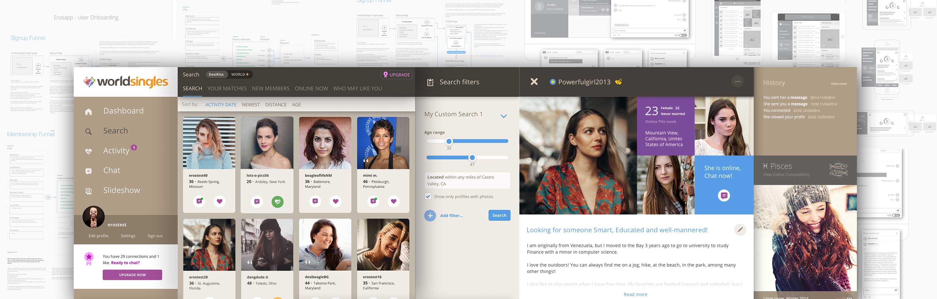
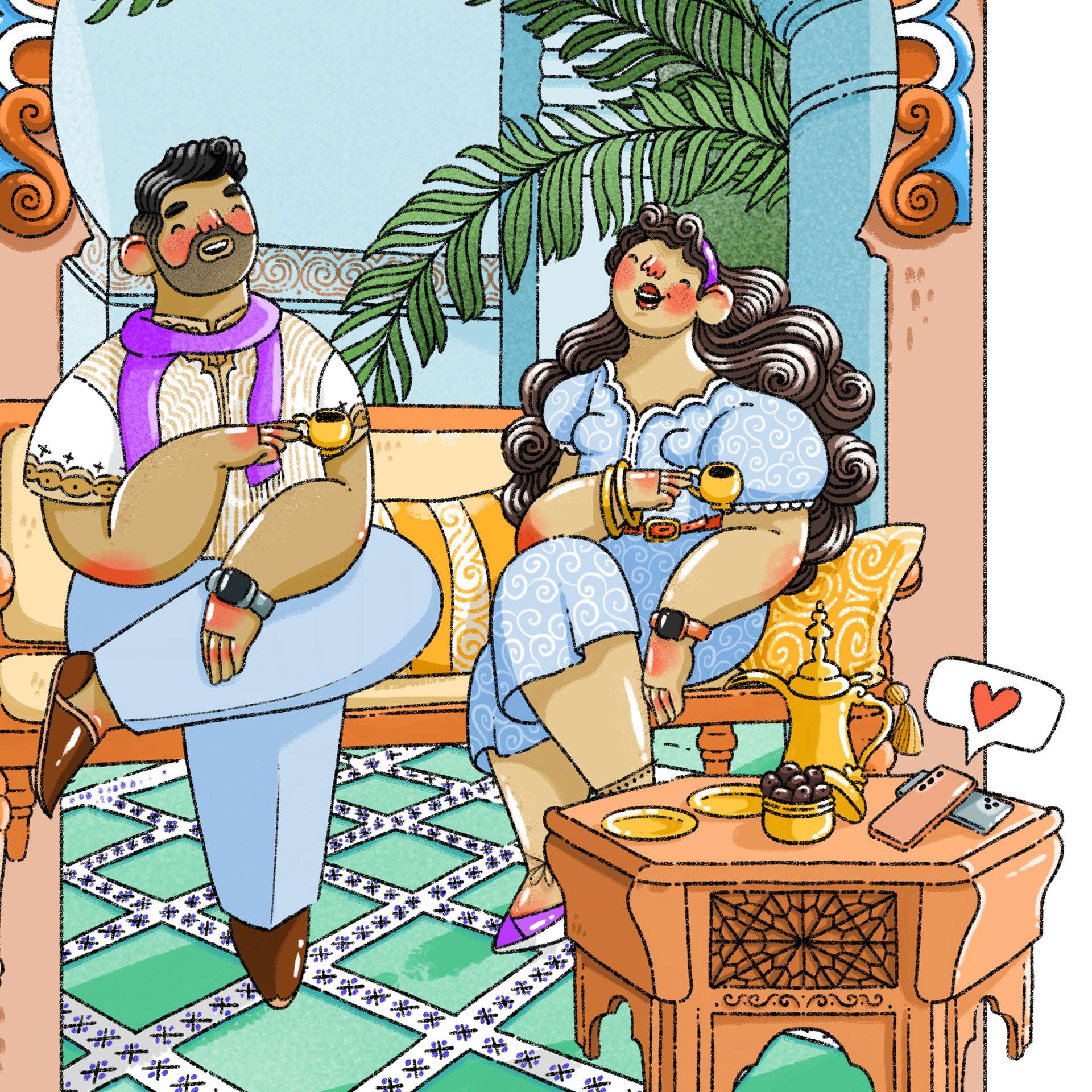
Back in 2014, the WSN platform faced issues with user retention, low engagement, and an outdated user interface. As mobile devices began dominating the market, like many other companies, WSN needed to adapt to these significant changes.
Design Goals and Objectives
Our goal was to, by incorporating Design Thinking within the organization, give a fresh look to the outdated website and create an engaging platform with these key objectives:
- Boost user retention.
- Enhance user engagement through personalized experience.
- Ensure a consistent experience across all platforms and devices.
- Modernize the user interface while preserving trust and reliability.
- Increase user conversion rates.
- Drive higher user activity levels.
- Simplify onboarding for a fearless experience.
- Reform and elevate the brand's image.
My Role and Responsibilities
In my role as a Senior Product Designer, I guided both the Design and Frontend teams in a comprehensive redesign, essentially building a brand-new web application from the ground up.
My daily routine was filled with brainstorming sessions and cross-functional meetings with Design, Frontend, Product, Business, and Revenue teams. Additionally, I was actively involved in both design and development tasks. Here are some key responsibilities:
Promoting Design Thinking Culture
- Advocated for a Design Thinking culture, promoting the importance of design and user empathy within the organization.
Conducting User Research and Gathering Insights
- Leveraged user research to understand user needs and preferences, using tools like surveys, interviews, and data analysis.
- Gathered actionable insights to inform design decisions and enhance the user experience.
Designing Wireframes, Prototypes, and Visual Assets
- Created wireframes and interactive prototypes to visualize the redesigned user interface and user journeys.
- Developed visually appealing and user-friendly design assets, including icons, graphics, and UI components.
Collaborating with the Development Team
- Worked closely with the development team to ensure the smooth and successful implementation of design changes.
- Provided guidance on design specifications and collaborated on the technical aspects of the project.
Implementing User-Centric Design Principles
- Applied user-centric design principles to all aspects of the project, with a focus on improving usability, accessibility, and overall user satisfaction.
Continuous Iteration and Improvement
- Engaged in an iterative design process, refining designs based on user feedback and usability testing results.
- Implemented improvements and updates to address user pain points and enhance the overall user experience.
Cross-Functional Communication
- Facilitated effective communication and collaboration between various teams, ensuring alignment with design goals and project objectives.
- Worked closely with Product, Business, and Revenue teams to balance design with business needs.
Conversion Optimization
- Strategically designed and optimized user flows and interfaces to improve user conversion rates and achieve business goals.
Frontend Development
- I actively participated in the development of the SPA using the latest web technologies such as React.js, Redux, CSS Modules, PostCSS, CSS3, HTML5, Jest, Webpack, and more
Achievements
The project was large in scale and ambition, and although we encountered challenges and learned from them, we ultimately succeeded. The efforts we made had a significant impact, benefiting both users and the business:
- User satisfaction and experience improved by a noteworthy 30 NPS points.
- Revenue surged by an impressive 50%.
- We witnessed remarkable improvements of up to 400% in some KPIs.
- Innovation Culture, The organization experienced a cultural shift towards greater openness to new ideas and a willingness to take calculated risks.
Design Thinking in Action
Design Thinking is a user-centric methodology that prioritizes empathy, problem-solving, and creative ideation. It was at the core of our approach. In the context of our project at World Singles Networks, it played a pivotal role in transforming an outdated platform into a modern and engaging experience.
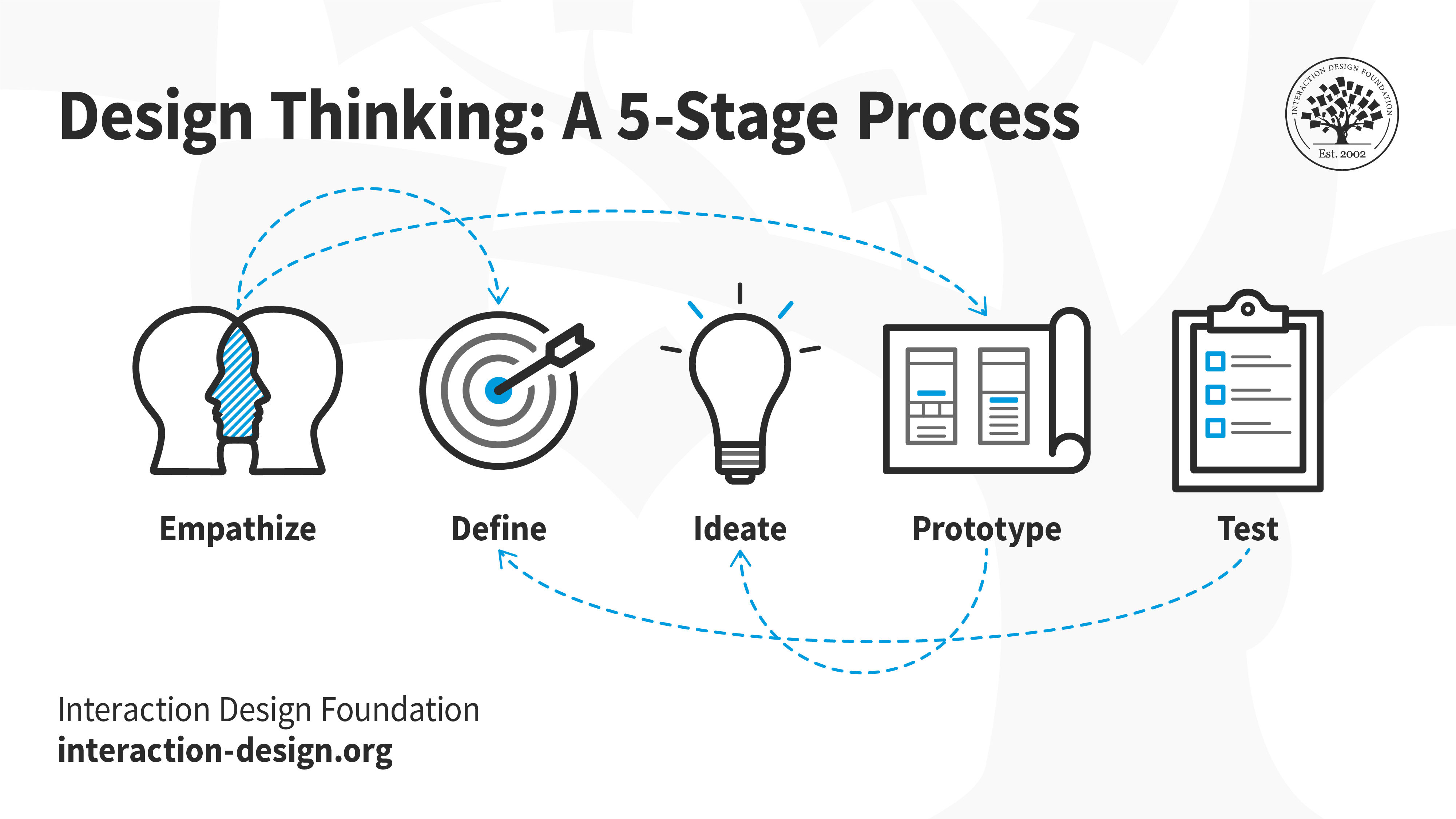
In deploying the Design Thinking approach at World Singles Networks, our initial step was to truly "Empathize" with our users. We deep-dived into understanding their needs, frustrations, and aspirations through a combination of surveys, user interviews, and data analytics tools. This provided us with a rich tapestry of insights that set the foundation for the next phase: "Define". Here, we distilled our findings into clear, actionable problem statements. By defining the core issues—ranging from outdated user interfaces to mobile incompatibility—we were able to pinpoint areas that required immediate attention. The subsequent phases, which included Ideation, Prototyping, and Testing, all hinged on these early stages of empathy and definition, ensuring our solutions were tailored to the real needs of our users and not based on assumptions.
1. Empathize
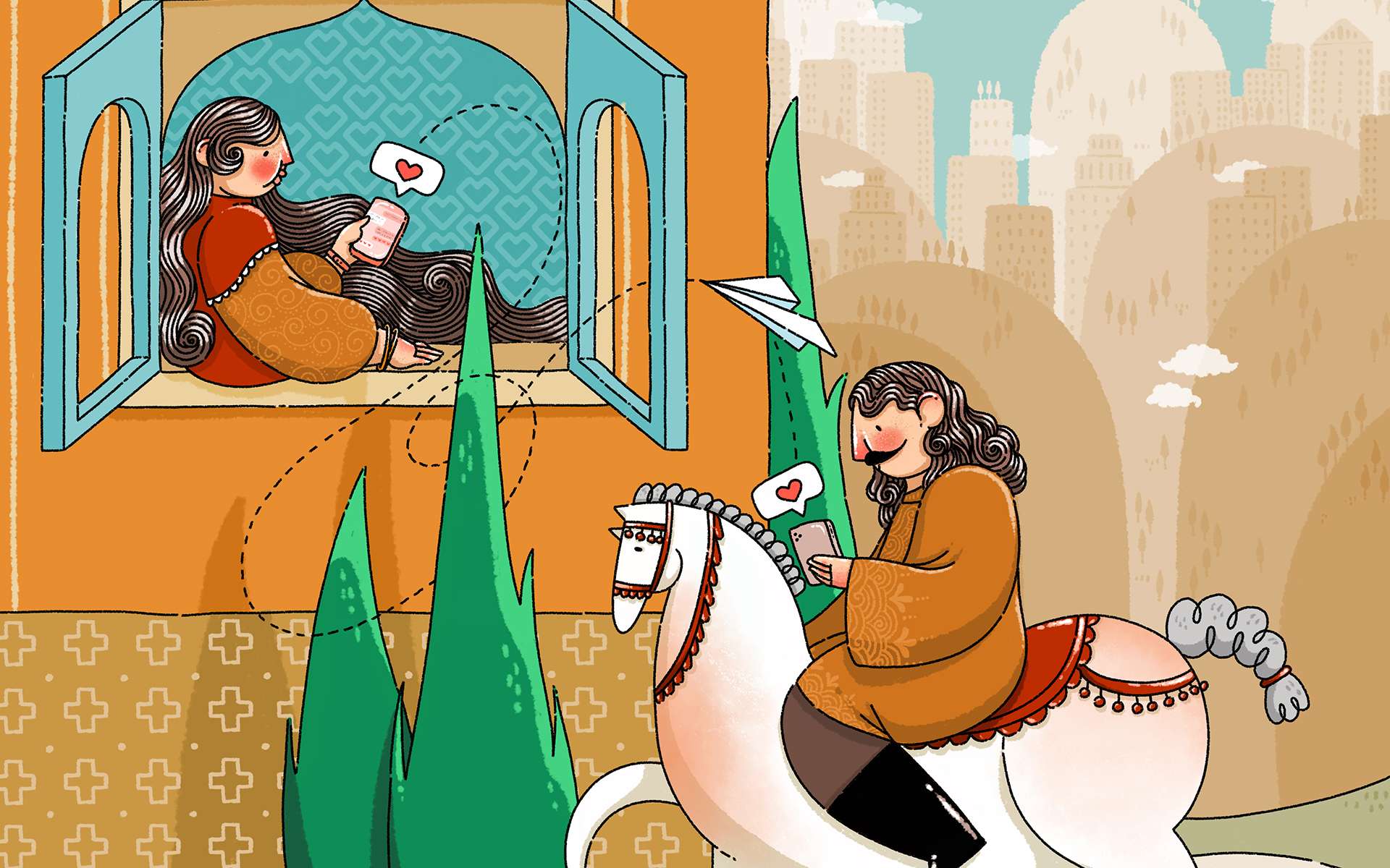
User needs were our guiding star. We started by understanding our diverse user base, which included individuals from various ethnic and cultural backgrounds. Gaining a holistic understanding of our users and the market landscape was essential. We employed a variety of research methods, focusing on:
User Research
Including in-depth interviews and surveys, we developed a clear picture of user preferences and issues. We used the Kano method to assess product's features based on customer feedback.
Market Analysis
Studied both direct and indirect competitors in the Online Dating industry to understand current market trends, strengths, weaknesses, and opportunities for differentiation.
Data Analysis
Tools like GA4 and FullStory offered insights into user behavior, performance metrics, and recurring challenges. The synthesis of all findings led to a comprehensive report that became our redesign beacon.
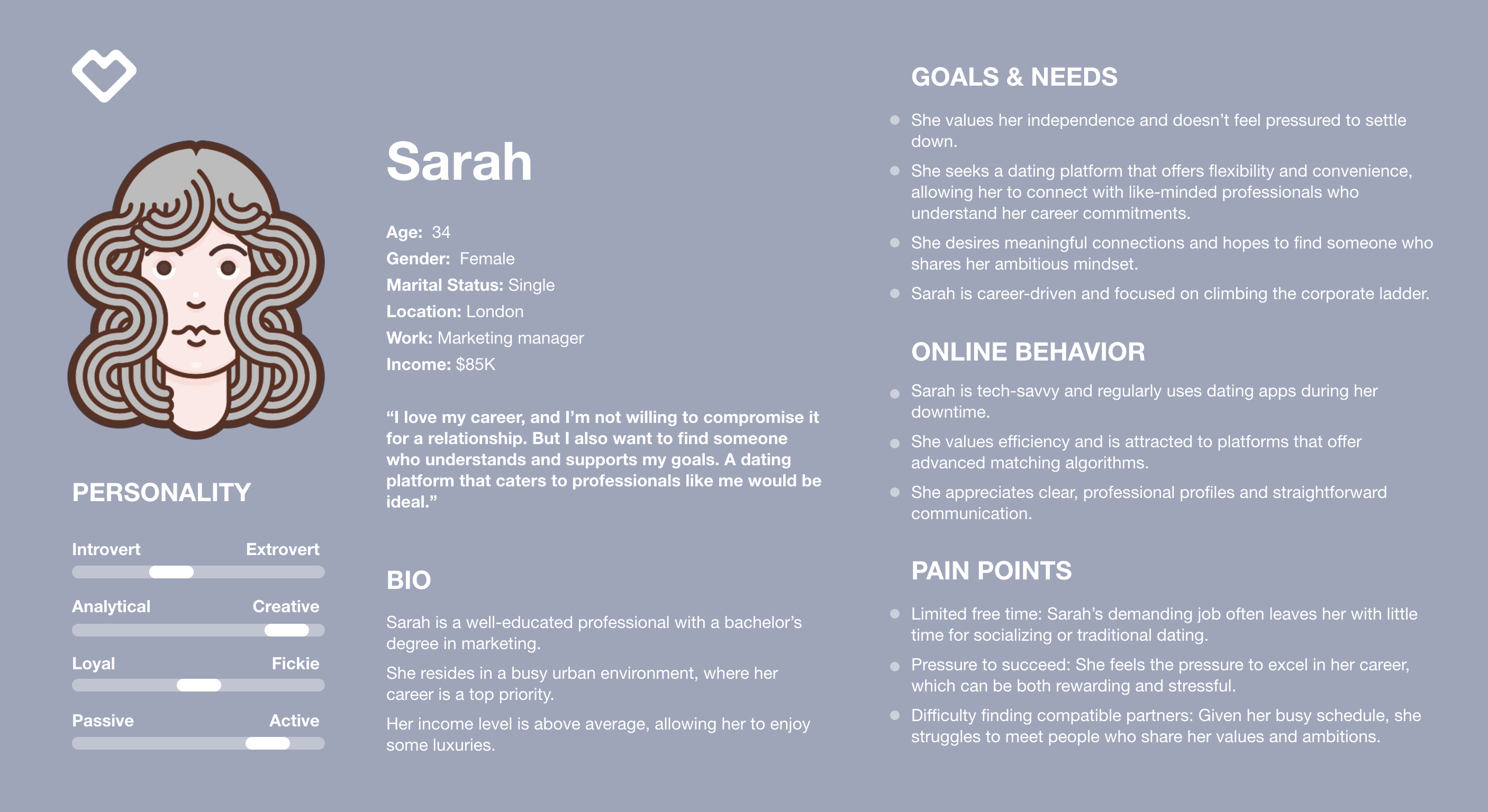
Personas
We crafted comprehensive user personas to ensure that our design decisions deeply resonated with real users, fostering empathy among designers and developers who gain insight into users' both professional and personal contexts.
2. Define
Peeling back the layers of World Singles Networks, we found multiple challenges. Some were surface-level, while others were deeply ingrained due to past choices. If ignored, these issues could harm the platform's future. The primary issues we identified included:
Profile Quality: Users often encountered incomplete or poorly curated profiles. This lack of comprehensive information made it difficult for them to gauge the compatibility of potential matches.
Privacy and Lack of Trust: Users reported concerns about the Privacy, authenticity of profiles and safety while interacting with other users. Trust issues stemming from fake profiles and inadequate security measures affected their willingness to engage on the platform.
Inconsistent UX and Outdated Visual Design: Users experienced a lack of consistency in the platform's design and functionality. The absence of a dedicated design team led to varying user experiences and a lack of a coherent visual identity. The platform's outdated visual design created usability issues. Users encountered difficulties in navigation, and calls to action (CTAs) were often unclear, diminishing the overall user experience.
Mobile Incompatibility: Users on smaller screens faced significant challenges as the platform was not mobile-friendly. This resulted in a frustrating and disjointed experience for mobile users.
Subscription Price Concerns: Many users were deterred by the platform's subscription pricing model. They found the cost of premium memberships to be relatively high, which limited their willingness to commit to long-term subscriptions. Users expressed a desire for more flexible pricing options that catered to their budget constraints.
Complex Profile Creation Process: Users encountered difficulty when trying to create profiles due to the extensive and convoluted steps involved. The process of filling out numerous fields and providing detailed information was time-consuming and often frustrating. Users sought a streamlined and user-friendly profile creation process to encourage more active participation on the platform.
Performance Lags: Users encountered slow loading times and unresponsive features while using the platform. The platform's performance issues negatively impacted their overall experience and made it less enjoyable to use.
3. Ideate
Embarking on this phase, we adopted a systematic and cyclical approach, channeling insights from our initial research into practical design solutions. At every step, the user remained our focal point, ensuring that the redesign was both user-centric and synergized with business objectives
Ideation and Brainstorming
Kicking off with intensive brainstorming sessions, our team, comprised of designers, UX experts, and product managers, generated a lot of solutions to address user pain points and elevate engagement levels. After ideation, each concept went through a detailed evaluation against set criteria, ensuring alignment with user aspirations and our main business objectives.
Information Architecture
Considering the platform's structure, we emphasized structural design to create an intuitive and accessible hierarchy. With user flow mapping, we charted the user journey, ensuring an effortless and logical navigation experience throughout the platform.
4. Prototype
Armed with insights and a clear direction, our designers crafted meticulous wireframes to blueprint the platform's revamped structure. Progressing to the prototyping phase, tools like Adobe XD and Figma proved invaluable.
These interactive prototypes simulated real-world user interactions, offering a preliminary glimpse into user reactions and gathering essential feedback.
5. Test, Measure and Validate
To truly appreciate and understand the effectiveness of our design decisions, it is imperative to incorporate a robust system of measurement and validation.
Defining KPIs: For every design decision we made, a corresponding rationale was established. This was then manifested into specific Key Performance Indicators (KPIs). Metrics like engagement rates, conversion percentages, and user satisfaction scores became our touchstones, painting a clear picture of our design's efficacy. Our vigilant watch over the critical path enabled us to quickly pinpoint and rectify potential challenges.
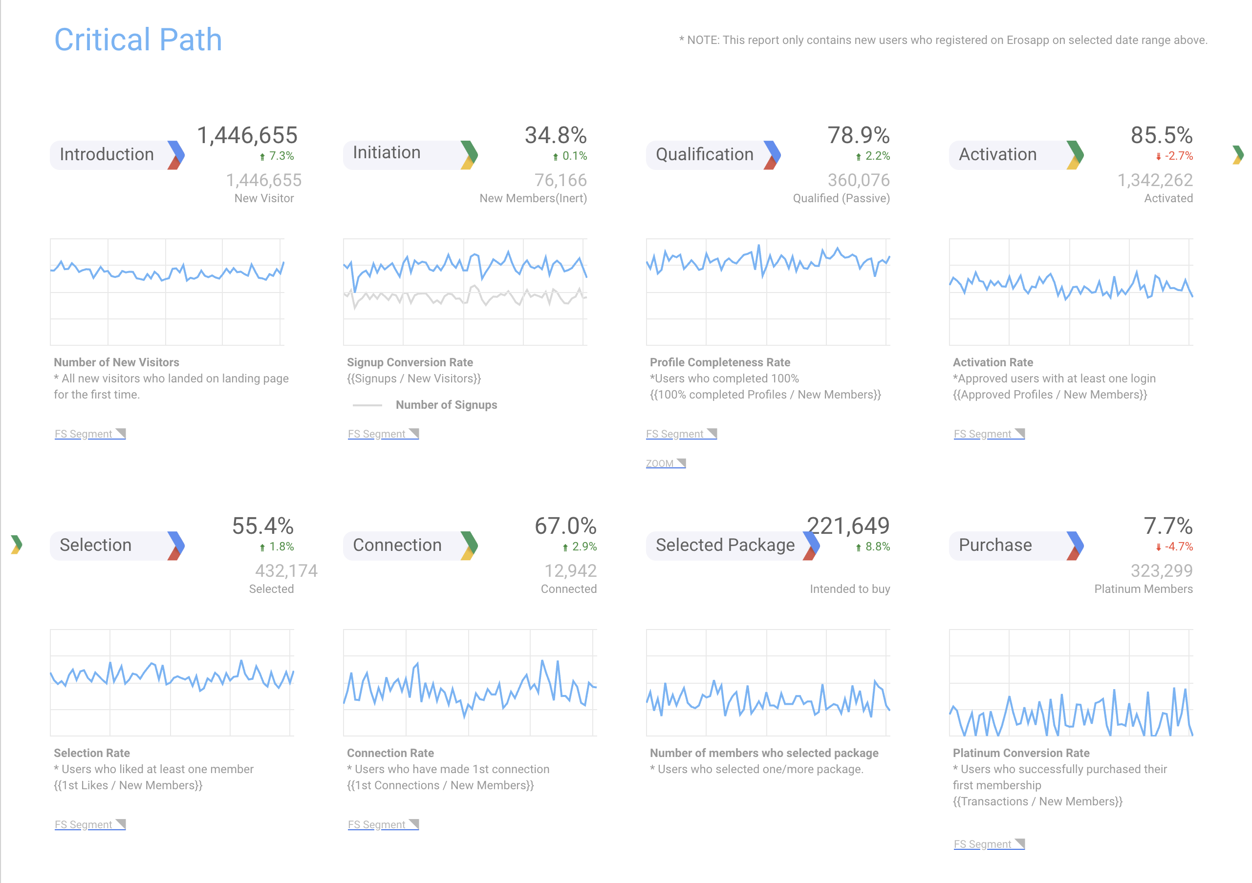 Random data just for preesntation
Usability Testing: Engaging directly with users allowed us to tap into their genuine experiences. Their feedback was instrumental in identifying both the high points of our design and areas requiring further refinement.
A/B Testing: We didn’t rely on assumptions. Instead, we used A/B tests to showcase different design variations to distinct user groups, gathering concrete data on what truly resonates with them.
Analytical Tools: Our utilization of platforms like Google Analytics and FullStory furnished us with a detailed view of user interactions. Tools like heat maps and user flow diagrams enriched our understanding, adding a quantitative layer to our qualitative insights.
Slow Release and Feature Flags: We tactically rolled out design changes, sometimes in phases or to specific user segments. The use of feature flags granted us the flexibility to toggle specific design elements, aiding in a focused evaluation of their effects.
Feedback Loops: With tools like Delighted, we kept the channels open for continuous user feedback, ensuring our designs remained both current and user-centric.
Design Thinking: Beyond Linear Boundaries
The very essence of Design Thinking lies in its ability to break free from linear constraints. While traditional problem-solving methodologies might progress in a straight line from problem identification to solution implementation, Design Thinking thrives on its cyclical nature, embracing iteration and feedback loops.
In our journey with World Singles Networks, this non-linear approach was a beacon, guiding us through the murky waters of redesign. Initial ideas were not set in stone; they were constantly shaped and reshaped based on feedback, testing, and real-world application. Each stage, be it empathy, ideation, or prototyping, was revisited multiple times, enriching the process with fresh insights and perspectives.
For example, the latest big refinement was to introduce redesigned profile page focused on Chat and better overall navigation and UX. not just to improve user experience but to allow business to introduce new features that users requested on the Kano surveys.
Visual Design
Design System
As we transformed our wireframes into vibrant interfaces, every design element underwent a meticulous rejuvenation. From the selection of a vibrant color palette to the adoption of contemporary typography and intuitive icons, every aspect was reimagined. The establishment of a unified design system did more than just ensure a seamless user experience; it became a catalyst, expediting future design processes and enhancing user-friendliness across the platform.
Design Documentation
Bridging the realms of design and development requires precision and foresight. Our team crafted an exhaustive design documentation, capturing everything from intricate layout details and color codes to interaction protocols. This served as a clear and concise guide, empowering the development team to faithfully realize our envisioned design, streamlining their efforts and minimizing room for ambiguity.
Development Process
Frontend Development
Utilizing a modern technology stack including React.js, Redux, CSS Modules, PostCSS, CSS3, HTML5, Jest, and Webpack allowed us to build a highly interactive and responsive platform. The implementation of design elements was done meticulously to preserve the visual appeal while ensuring seamless user interactions. This phase saw challenges like ensuring the design's responsiveness across devices, which was tackled by employing a mobile-first approach. in addition of responsive, we created a Fluid Grid System to make sure app fit the screen size on any screen sizes. Performance optimization was a key focus, where techniques like lazy loading and code splitting were employed to ensure the platform's swift loading and rendering, enhancing the user experience substantially.
Backend Development
The backend was optimized to handle the increased traffic. A robust set of APIs were developed to ensure a seamless data flow between the frontend SPA and backend, enabling features like real-time messaging and notifications which were crucial for user engagement on the platform. The backend team worked closely with the frontend team to ensure the APIs were well-documented and met the necessary security standards.
Cross-Functional Collaboration
Effective communication was maintained through tools like Slack and Jira, ensuring a smooth workflow between design, front-end, and back-end teams. Problem-solving was done collaboratively, with daily stand-ups and sprint reviews to address any blockers and ensure that the project was on track. This collaborative effort helped in overcoming significant challenges like integrating a new real-time notification system to keep the users engaged. not to mention that Agile methods had a huge impact on the success of this process.
Quality Assurance
Thorough testing was conducted encompassing unit tests and integration tests, ensure the platform’s reliability and usability. Feedback loops were established with internal teams and beta testers to gather constructive feedback which was invaluable in refining the platform further. after releasing each feature, we carefully monitored users on FullStory to made sure there were no hidden problems. Indeed we were surprised with our findings that helped to refine iteratively to ensure the platform met the desired standards.
Post-Design Enhancements
After the primary design phase, our focus shifted to refining and expanding the platform's broader visual and functional landscape. This entailed a series of enhancements to ensure a cohesive brand experience and maximize user engagement.
We updated the company's logo and branding to resonate with modern aesthetics. To maintain visual consistency across all touchpoints, a clear brand language was established, supported by a robust Design System and Development Tokens.
Recognizing the importance of organic traffic, we designed SEO-optimized landing pages and Refined and updated email templates to align with our updated branding, ensuring compatibility across all email clients and introducing a robust dark theme support. Collaborating with artists, we infused the platform with captivating illustrations that added personality and improved user engagement.
We adopted a proactive approach, regularly reviewing and fine-tuning the design based on real-world usage, ensuring it always met user needs. The branding extended to marketing materials, which were crafted in line with the new brand guidelines. Finally, our commitment to a stellar user experience was solidified with ongoing SEO and performance optimizations, guaranteeing the platform's speed and accessibility matched its fresh new look.
Challenges and Lessons
Incorporating Design Thinking taught us that leadership support is essential for providing resources and overcoming resistance. We also learned that training and education are crucial for equipping employees with the right skills and fostering a shared commitment to user-centered thinking.
Balancing a fresh design with maintaining brand trust was one of our primary challenges. We also had to consider the diverse needs of users from different cultures, ensuring the design resonated globally. Keeping user Privacy and complying with regulations like GDPR was equally crucial.
Incorporating internationalization into the design process posed its own set of challenges. Given the diverse nature of our user base, ensuring that the design was adaptive and responsive to different languages, script directions (like right-to-left for languages such as Arabic), and cultural nuances became paramount. This meant conducting more rigorous user testing in various regions and adapting our designs based on this localized feedback.
Our strategy centered on involving users in the design process. This not only led to innovative solutions but also guaranteed our designs were user-friendly. We aimed for a design direction that both users would appreciate and that aligned with the brand's history and objectives.
From this project, we learned the importance of placing users at the forefront of every design decision. Collaborative input from all teams, not just designers, is vital for a holistic design. Additionally, the continuous refinement of designs based on feedback and the value of open communication across teams stood out as key takeaways. Embracing these insights ensures the success of our future design endeavors.
Reflections
This embrace of Design Thinking yielded substantial outcomes. The organization underwent a profound metamorphosis, fostering a culture of innovation that permeated every facet of the company. Employees became more open to novel ideas and more willing to embrace calculated risks, nurturing an environment where creativity thrived. As a result, the company witnessed a surge in productivity and problem-solving capabilities. Teams adopted the principles of iterative prototyping and testing, which substantially reduced the time-to-market for new products, ensuring that the company remained agile and responsive to changing market dynamics.
Looking back at our journey with World Singles Networks, it reaffirmed my belief in the power of understanding users and the magic of modern design. From addressing core issues to enhancing user experience, our mission was simple yet profound – connect hearts from around the world. The journey underscored the importance of staying updated, being user-centric, and always striving for excellence in design and performance. To all aspiring designers and developers out there, always remember: It's never just about creating something beautiful. It's about creating something that works beautifully.
Project Links
Compnay Website
Web App
iOS Apps
Android Apps
Thank you for diving deep into this case study with me. If it sparked any thoughts or questions, I'd love to hear them. Interested in seeing more of my work or collaborating on a future project?
LET'S COLLABORATE!